
We designed BOZONO's brand identity and premium label system, bringing its logo, color palette, typography, and packaging into one scalable visual language.
The challenge
BOZONO needed a clear and cohesive visual identity to build recognition in a competitive category. Without a defined system, communication felt fragmented, differentiation was limited, and the brand's personality did not carry consistently into its products.
The project connected two needs:
- Build a solid, recognizable, and contemporary brand identity.
- Design labels for a premium product line aligned with that identity.
The solution had to work just as clearly across digital applications, social media, brand materials, and packaging, without losing consistency between formats or scales.
What we did
Strategy and differentiation
We began with a visual benchmark and an analysis of the category's established codes. This work helped us identify conventions, find opportunities for differentiation, and define a distinct design direction for BOZONO.
Concept: structured simplicity
The identity was built around structured simplicity: a language combining geometric precision, clean compositions, and deliberate use of space. The system removes what is unnecessary and focuses the brand's expression on solid forms, clear hierarchy, and consistent visual decisions.
Logo and visual language
The logo was designed to preserve balance, legibility, and recognition at different sizes. From it, we developed a broader visual system based on:
- Grids that organize information.
- Precise use of space.
- Graphic elements aligned with the core concept.
- Compositions that adapt to digital and print applications.
Color and typography
The color palette strengthens BOZONO's recognition, creates contrast, and conveys a contemporary personality. Color is used strategically: each tone has a role within the system instead of acting as decoration.
The contemporary type system supports clear reading, strong hierarchy, and consistency across touchpoints. Together with the palette and grid, it gives the brand a stable visual voice.
Label and packaging design
The identity was extended to the premium product labels, turning the brand system into a tangible experience. The application preserves BOZONO's structure, contrast, and legibility while strengthening the product's sense of value and quality.
Results
The new identity gives BOZONO a unified visual system for communicating more clearly and standing apart within its category.
The project established a foundation that can grow without losing consistency:
- A legible and recognizable logo across different scales.
- A color palette and type system with clearly defined roles.
- A graphic language that adapts to digital platforms, social media, and brand materials.
- Premium labels aligned with BOZONO's personality and positioning.
Rather than a single design piece, the result is a scalable identity and packaging system that can support new applications with one consistent visual direction.
Gallery
BOZONO primary logo 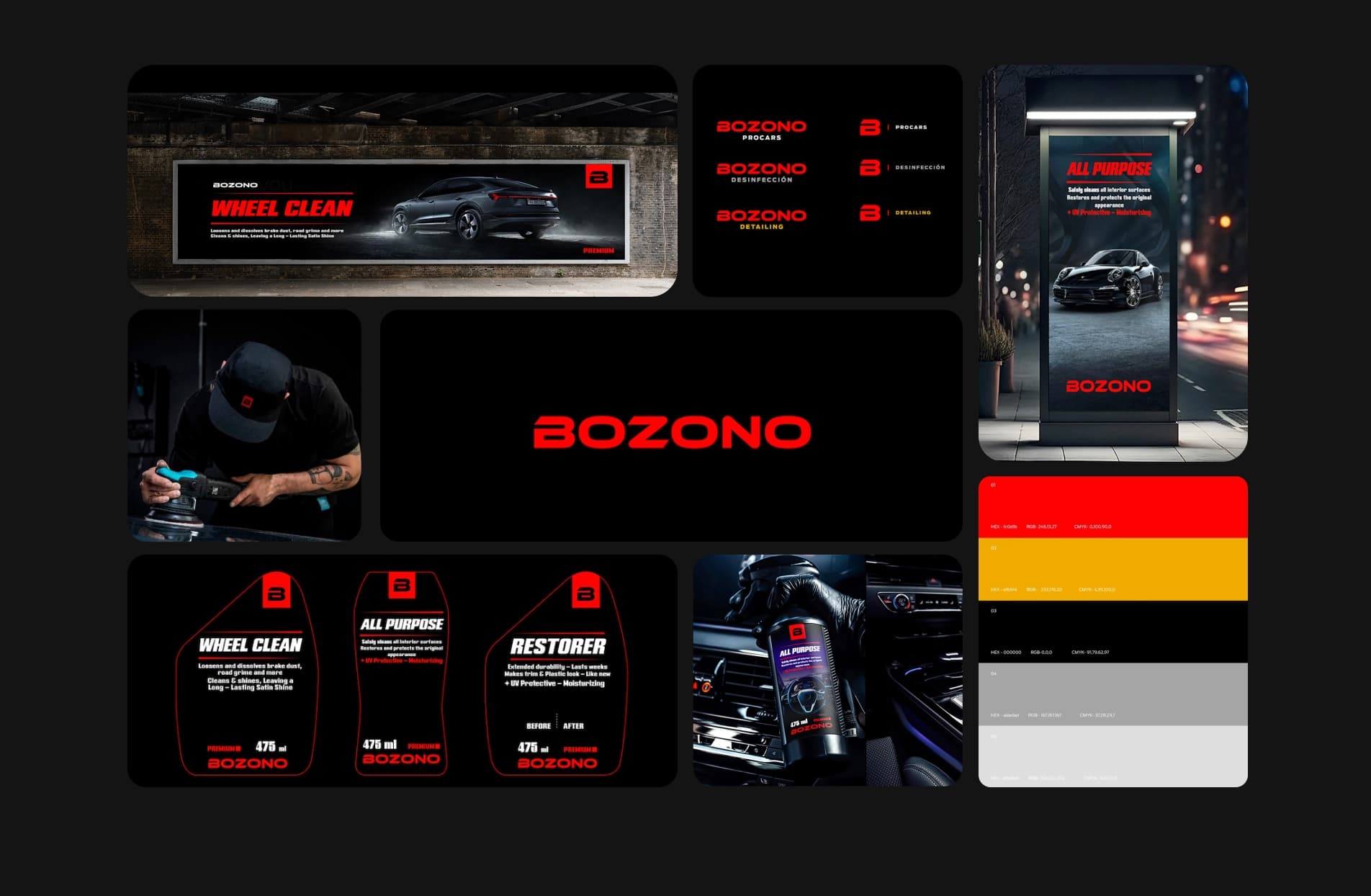
Brand identity system and applications 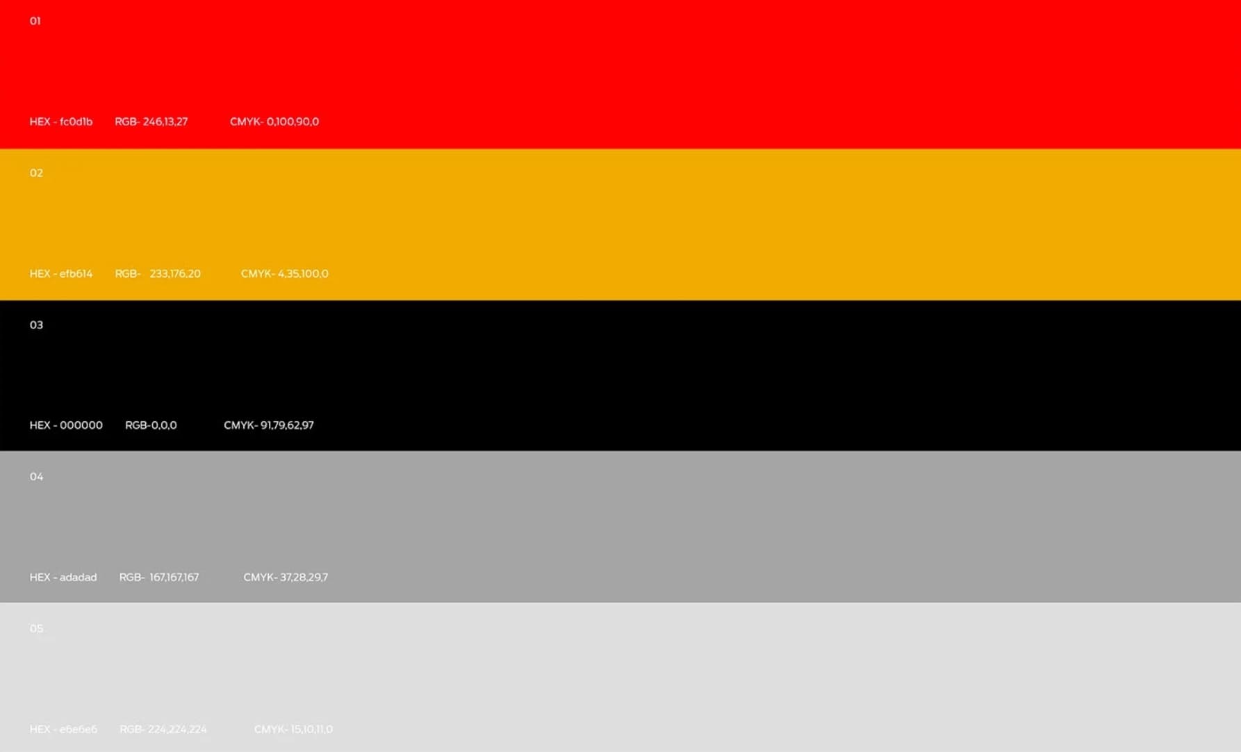
BOZONO color palette
